Data Visualization
Contents
Data Visualization
Data Visualization can refer to a lot of different things. Here, we will start with making static 2D visualizations of data.
To do so, we will use the matplotlib package. Matplotlib is a large and well supported package that forms the basis of a lot of plotting in Python.
# Import matplotlib - the main python plotting package
import matplotlib.pyplot as plt

# Import numpy functions for generating test data to plot
import numpy as np
from numpy.random import rand

# This magic command plots figures directly in the notebook
%matplotlib inline
# This sets a higher resolution for figures
%config InlineBackend.figure_format = 'retina'
Line graph
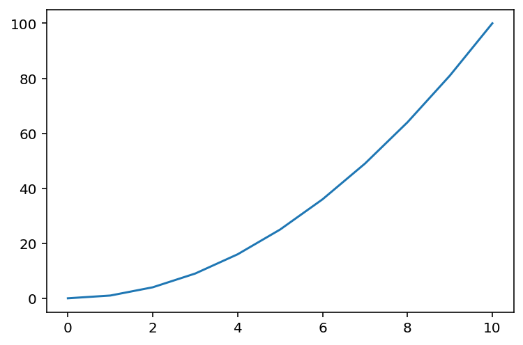
First, we will create a simple line graph.
# Let's create some fake data to plot
x = np.arange(0, 11)
y = x**2

# To plot, simply pass the x and y data to the plot function
plt.plot(x, y)
[<matplotlib.lines.Line2D at 0x11ad9a210>]
Without any other information, matplotlib will add a number of plotting attributes by default.
For example, by default we get lines around the plot, tick marks, and axis number labels.
We can customize all of these things, and add more stuff to the plot as well.
Scatter Plot
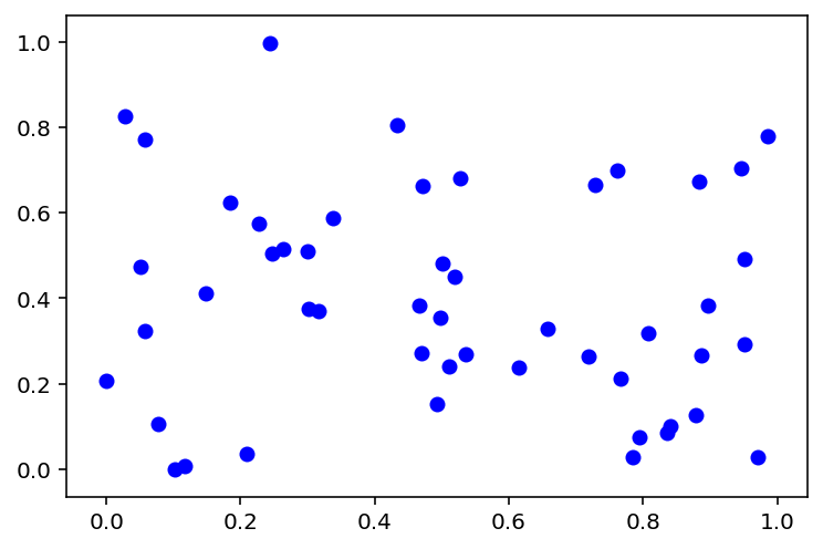
Next, lets try creating a scatter plot.
To do so, we can simulate two groups of data, that we want to plot together on a scatter plot to compare.
# Create some Data
n = 50                   # n is the number of data points
x = rand(n)              # Randomly create x data points
y1 = rand(n)             # Randomly create 1st group of y data points
y2 = rand(n)             # Randomly create 2nd group of y data points
Creating a Scatter Plot
The ‘scatter’ command works about the same as the plot command, but makes a scatter plot instead of a line.
Here, we’re adding another argument, color which specifies the color to make the points.
Note there are lots of optional arguments we can add to ‘plot’ and ‘scatter’, that we will explore more later.
# Plot the first set of data
plt.scatter(x, y1, color='blue')
<matplotlib.collections.PathCollection at 0x11ae17b90>
# Now, plot both sets of data together
#   We can do this by calling the plot call on each set of data
#   Subsequent plot calls, like this one, will by default plot onto the same figure
plt.scatter(x, y1, color='blue')
plt.scatter(x, y2, color='red')
<matplotlib.collections.PathCollection at 0x11b209e90>
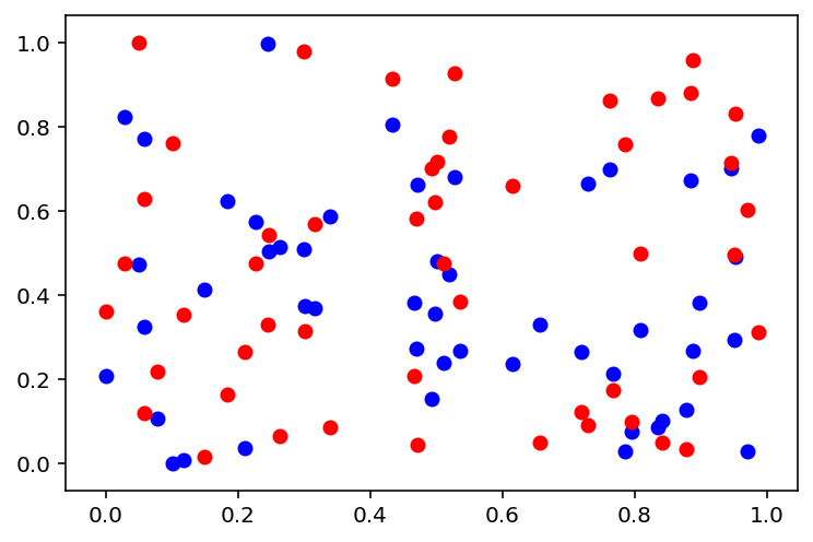
We now have a scatter plot!
Customizing Plots
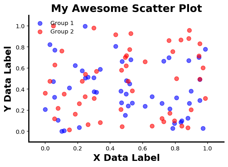
The plot above shows the data, but aesthetically there is more we could do to make it look nicer.
Next up, we will replot the data, and add some customization to the plot.
In the next cell, we will add lots of customization. It’s a large set of code, but to explore how it all works, work through bit by bit, and try passing in different values, and see what it does to the resultant plot.
# Create a new figure
#   In this case we are explicitly creating the figure that we will plot to
fig = plt.figure()
# Add an axes to our figure
#   Figures can have multiple axes. This adds a single new axes to our figure
ax = plt.axes()

# Plot the data again
ax.scatter(x, y1, color='blue', alpha=0.6, label='Group 1', s=50)
ax.scatter(x, y2, color='red', alpha=0.6, label='Group 2', s=50)
# Here we've added some more optional arguments:
#   alpha - sets the transparency of the data points
#   label - makes a label for the data we've plotted, which can be used in the legend
#   s (size) - changes the size of the dots we plot

# Add a title to our graph
plt.title('My Awesome Scatter Plot', fontsize=18, fontweight='bold')

# Add data labels
ax.set_xlabel('X Data Label', fontsize=16, fontweight='bold')
ax.set_ylabel('Y Data Label', fontsize=16, fontweight='bold')

# Set the ranges to plot of the x and y variables
ax.set_xlim([-0.1, 1.1])
ax.set_ylim([-0.1, 1.1])

# Set the tick labels
ax.set_xticks(np.array([0.0, 0.2, 0.4, 0.6, 0.8, 1.0]))
ax.set_yticks(np.array([0.0, 0.2, 0.4, 0.6, 0.8, 1.0]))

# Turn the top and right side lines off
ax.spines['right'].set_visible(False)
ax.spines['top'].set_visible(False)

# Set the tick marks to only be on the bottom and the left.
ax.xaxis.set_ticks_position('bottom')
ax.yaxis.set_ticks_position('left')

# Set linewidth of remaining spines
ax.spines['left'].set_linewidth(2)
ax.spines['bottom'].set_linewidth(2)

# Add a legend. This will use the labels you defined when you set the data.
ax.legend(loc='upper left', scatterpoints=1, frameon=False)
# Note that legend doesn't require any arguments
#   Here we optionally specifing:
#     'loc' - where to put the legend
#     'scatterpoints' - how many points to show in the legend
#     'frameon' - whether to have a box around the legend
<matplotlib.legend.Legend at 0x11b57e850>
Figures and Axes
Note that in the above example, we defined a figure object, fig, and an axes object, ax.
You might also notice that sometimes we used called function from plt, and sometimes called methods directly on the ax object.
So, what are these different things?
pltis then name we have given the imported matplotlib moduleHere, whenever we are using ‘plt’ we are calling a function from matplotlib
By default, this gets applied to the current figure (the most recent one created)
figis a variable name we have given to the figure objectA figure object is the whole figure that we are creating
We can use ‘fig’ (or whatever we call our figure) to access or update our figure after we have created it
axis also a variable name, for the current axisA figure can have multiple axes (though our figure above only has one)
To update a value on an axes object, you can call a
set_method on the axes object, like we do above
# 'fig' is a label for the figure we are working on.
# gcf() is a way to find the current figure.
print(type(fig))             # Figure is an object in matplotlib
print(fig)                   # This is the figure handle 'fig' we made before
print(plt.gcf(), '\n')       # gcf grabs the current figure. In this case, current figure is same as 'fig'
<class 'matplotlib.figure.Figure'>
Figure(432x288)
Figure(432x288)
<Figure size 432x288 with 0 Axes>
# 'ax' is a name for the current axes. A figure can have many axes (figures can have subplots)
print(type(ax))              # Axes is a class of variable in matplotlib
print(ax)                    # This is the axes handle 'ax' that we made before

# Note that if you need to grab the current axes, you can do so with `plt.gca()`
<class 'matplotlib.axes._subplots.AxesSubplot'>
AxesSubplot(0.125,0.125;0.775x0.755)
Keeping track of figures and axes, can be a bit confusing at first. Note that typically a lot of managing matplotlib objects objects can happen automatically. In many cases, many figures in different cells, for example, matplotlib will make new figures and axes when it needs to, without you having to explicitly specify this.
Defining or accessing figure and axes objects can be useful when customizing plots, replotting things later, or for more custom or complex plotting tasks. That is, it can be useful to have a label to grab our figure, and manipulate it, if and when we need to.
For example, we can get our figure back just by calling the figure object name.
# Redraw figure with 'fig' variable name
fig

Conclusion
This is only a brief introduction to the main concepts of matplotlib, that we will use throughout the rest of these materials. For much more in depth explanations and examples, visit the official documentation.